Responsive Website Design
- 75% of customers prefer a mobile friendly site*
- 61% of customers who visit a mobile unfriendly site are likely to go to a competitor’s site*
At Psand we always take a mobile first approach in our design process. This means that no matter what device your customers use to access your website, it will be fully optimised to give them a great experience.
We do this to help increase your conversion rate and improve your search engine ranking.
Benefits of Responsive Website Design
- Increases availability - Users can visit your website anytime from anywhere
- Saves time and development costs
- Increases sales and conversion rates
- Increases visibility in search engine rankings
- Improves download speeds - users can access content quickly
- Reduces support - one website, content and links to manage
- Improves SEO - Google recommends responsive website design
- Easier to monitor analytics and track conversion
Responsive Design Process
We work with you to analyse your traffic, customers and - most importantly - your business goals and objectives.
We use wireframing, prototyping and even the odd bit of voodoo to deliver a website that not only looks good, but achieves your goals and objectives.
Whatever the design, it can be integrated seamlessly into our content management system to enable you to control and update your own content whenever you want.
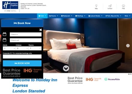
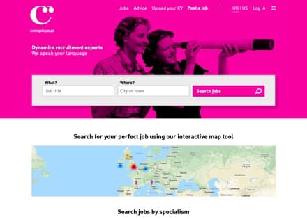
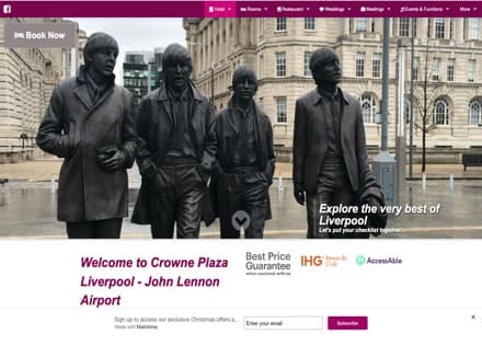
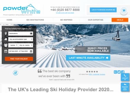
Example responsive design websites
Call us on +44 (0)117 325 1055